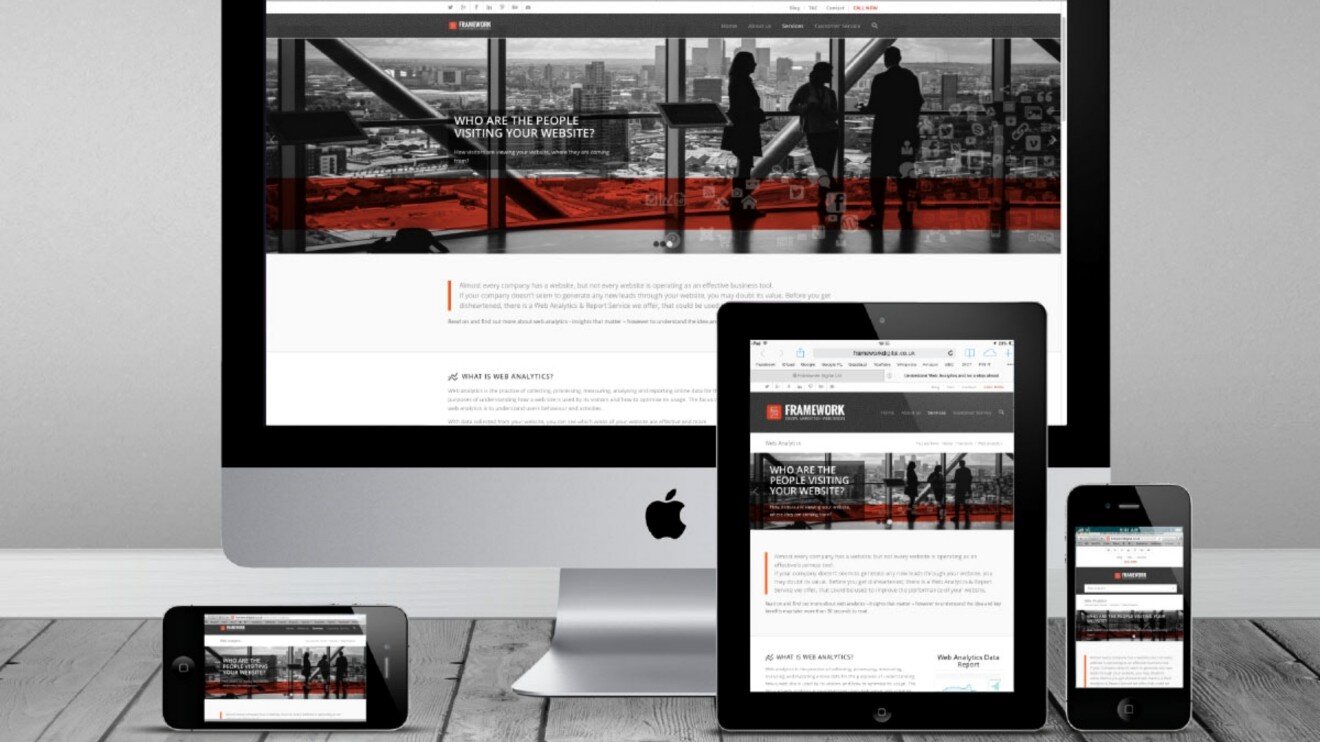
Responsive web design is an approach to building sites that ensures optimal display and interaction across different devices and screens. Responsive design lets a site automatically adapt to the visitor's screen size and resolution. "Creative Bureau 77" follows these responsive web design principles:
1. Flexible Grids: Using relative units of measurement — percentages or relative units like em and rem — to size and position page elements. This lets elements scale and resize depending on screen size.
2. Flexible Images and Media: Using CSS properties like max-width: 100% so images and media elements can scale and adapt to screen size. This lets images fit the available space without distortion or cropping.
3. Media Queries: Using CSS media queries to detect different screen conditions and apply matching styles for each. Media queries let us build different layouts and styles that apply depending on screen resolution and characteristics.
4. Flexible Content: Optimizing content for different screens so it stays readable and accessible regardless of screen size. This can include adjusting font sizes, simplifying the layout, and reorganizing elements for a better user experience.
Responsive web design lets a site adapt better to different devices — desktops, laptops, tablets, and mobile devices. It improves usability, enhances user interaction, and delivers a more pleasant, consistent experience across every device.